
モデルを訓練する
以下はニューラルネットワークモデルを訓練する手順です。
- モデル(ここでは”train_images”と”train_labels”)に訓練データを入力します
- モデルが画像とラベルの関連付けを学習します
- モデルにテストデータ(ここでは”test_images”)を入力し、予測させます。予測が”test_labels”と一致する事を確認します。
訓練を開始させるにはmodel.fit()を使います。この関数はモデルを訓練データに合う様にします。
model.fit(train_images, train_labels, epochs=5)
【結果】
Epoch 1/5
60000/60000 [==============================] - 4s 68us/step - loss: 0.4962 - acc: 0.8259
Epoch 2/5
60000/60000 [==============================] - 4s 69us/step - loss: 0.3770 - acc: 0.8642
Epoch 3/5
60000/60000 [==============================] - 4s 62us/step - loss: 0.3372 - acc: 0.8768: 1s - loss: 0.3375 -  - ETA: 0s - loss:
Epoch 4/5
60000/60000 [==============================] - 4s 70us/step - loss: 0.3132 - acc: 0.8855
Epoch 5/5
60000/60000 [==============================] - 4s 61us/step - loss: 0.2955 - acc: 0.8914
<tensorflow.python.keras.callbacks.History at 0x13bf65c88>
モデルの訓練中に損失と精度のメトリクスが表示されます。このモデルは89%の精度まで行きました。
精度を評価する
次にテストデータセットでモデルの検証を行います。
test_loss, test_acc = model.evaluate(test_images, test_labels)
print('Test accuracy:', test_acc)
【結果】
10000/10000 [==============================] - 1s 51us/step
Test accuracy: 0.8787
精度は約88%でした。訓練データよりも精度が劣る結果になりました。訓練データの結果と、テスト用データの結果の差が大きすぎると訓練データに特化したモデルになっていると見なされます。これを過学習といいます。
数学の問題と答えを丸暗記した人が、テストで問題の表現が少し変わっただけで解けなくなる様な状況に近いと思います。
予測する
実際にいくつかの画像を予測してみましょう。ここではテスト用画像を予測させます。
最初の予測結果を表示します。
predictions = model.predict(test_images)
predictions[0]
【結果】
array([1.0525109e-05, 1.8442023e-07, 1.3353867e-06, 1.3481757e-09,
       4.3788818e-06, 5.8854553e-03, 6.6935104e-06, 2.0149920e-02,
       3.2312033e-04, 9.7361833e-01], dtype=float32)
予測は10個の数字の配列です。各要素は衣服の10分類のそれぞれに対応する「信頼性」を表しています。どのラベルが最も高い信頼値を持っているかを表示します。
np.argmax(predictions[0])
【結果】
9
ラベル9はankle bootです。test_labels[0]と比較して同じであれば予測が正しいと判断できます。
test_labels[0]
【結果】
9
これをグラフ化します。各分類に属する確率が一目でわかる様になります。以下は画像と、グラフを表示するための関数定義です。
def plot_image(i, predictions_array, true_label, img):
  predictions_array, true_label, img = predictions_array[i], true_label[i], img[i]
  plt.grid(False)
  plt.xticks([])
  plt.yticks([])

  plt.imshow(img, cmap=plt.cm.binary)

  predicted_label = np.argmax(predictions_array)
  if predicted_label == true_label:
    color = 'blue'
  else:
    color = 'red'

  plt.xlabel("{} {:2.0f}% ({})".format(class_names[predicted_label],
                                100*np.max(predictions_array),
                                class_names[true_label]),
                                color=color)

def plot_value_array(i, predictions_array, true_label):
  predictions_array, true_label = predictions_array[i], true_label[i]
  plt.grid(False)
  plt.xticks([])
  plt.yticks([])
  thisplot = plt.bar(range(10), predictions_array, color="#777777")
  plt.ylim([0, 1])
  predicted_label = np.argmax(predictions_array)

  thisplot[predicted_label].set_color('red')
  thisplot[true_label].set_color('blue')
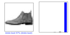
0番目の予測と結果
i = 0
plt.figure(figsize=(6,3))
plt.subplot(1,2,1)
plot_image(i, predictions, test_labels, test_images)
plt.subplot(1,2,2)
plot_value_array(i, predictions,  test_labels)
【結果】
12番目の予測と結果。Sandalと予測しましたが、正しくはSneakerでした。「信頼値」は63%でした。
i = 12
plt.figure(figsize=(6,3))
plt.subplot(1,2,1)
plot_image(i, predictions, test_labels, test_images)
plt.subplot(1,2,2)
plot_value_array(i, predictions,  test_labels)
【結果】
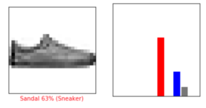
正しい予測ラベルは青で、間違えた予測ラベルは赤で表示されます。本家のチュートリアルでは予測がBag、その信頼値が51%でした。チュートリアル通りにやりましたが何が原因で値が変わったかは不明です。
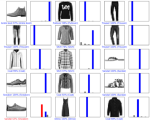
もっと予測と結果をみてみましょう。
num_rows = 5
num_cols = 3
num_images = num_rows*num_cols
plt.figure(figsize=(2*2*num_cols, 2*num_rows))
for i in range(num_images):
  plt.subplot(num_rows, 2*num_cols, 2*i+1)
  plot_image(i, predictions, test_labels, test_images)
  plt.subplot(num_rows, 2*num_cols, 2*i+2)
  plot_value_array(i, predictions, test_labels)
【結果】


コメントを残す